Election Forecasts with Hourly Updates
The Virtual Tout® uses political horizon charts to show hourly updates of election forecasts.
Reported results from prediction surveys and models take a form similar to results from prediction markets, providing hourly updates of election forecasts.
Illustrated in the political horizon chart below are actual data from a North Carolina prediction market. The presidential election in North Carolina was especially interesting because election forecasts for that state had numerous transitions between Democratic and Republican margins of victory.
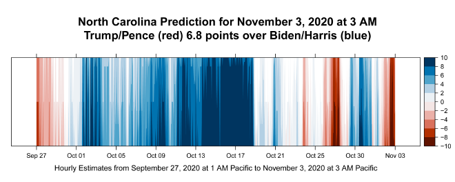
This political horizon chart shows 884 hourly forecasts organized by time, ending with the final forecast from The Virtual Tout® on the morning of election day.
Chart colors indicate the direction of margin-of-victory forecasts: Red for Republican advantage, blue for Democratic advantage. The darker the color, the stronger the advantage. White in the chart shows periods of time when the election was a toss-up, too close to call.
The certified results from the 2020 presidential election had the Trump/Pence ticket capturing 49.9% and the popular vote in North Carolina, with the Biden/Harris ticket capturing 48.6%. That gives a 1.3% Republican margin of victory, compared with the 6.8 Republican margin from the prediction market. This result is consistent with the observation that prediction markets have a Republican bias.
Prediction-market-based forecasts from The Virtual Tout® can be expected to be more accurate than forecasts from prediction markets themselves because our forecasts adjust for anticipated biases in prediction markets.
Prediction-survey-based forecasts from The Virtual Tout® can be expected to be more accurate than forecasts from prediction markets themselves because our forecasts are based on models that incorporate both prediction survey and census data.
Political horizon charts represent a unique contribution of The Virtual Tout®. A political horizon chart is more informative than a map of red- and blue-colored states of the United States (choropleth map), which shows forecasts at only one point in time.
Political horizon charts show the progress of political campaigns across time, pitting Democratic candidates against Republican candidates in each contest. The Political Horizon Charts podcast on Spotify explains horizon charts with chance-of-winning percentage differences, which are similar to margin-of-victory percentages as shown above.